15 Kitchen Wall Decor Prints and Posters That Instantly Lift a Plain Wall
A blank kitchen wall does more damage than you think. You notice it every time you wait for the kettle, every time you eat breakfast in silence.
Prints and posters fix that fast. They cost less than new cabinets, hang in an afternoon, and swap out whenever your taste changes.
The trick is choosing the right kind of print for the right spot. A steamy wall near the hob needs glass and a sealed frame, while a dry dining wall can take anything.
Below are fifteen print and poster ideas that work in real kitchens, from bold typography to vintage market posters and practical charts you will actually use.


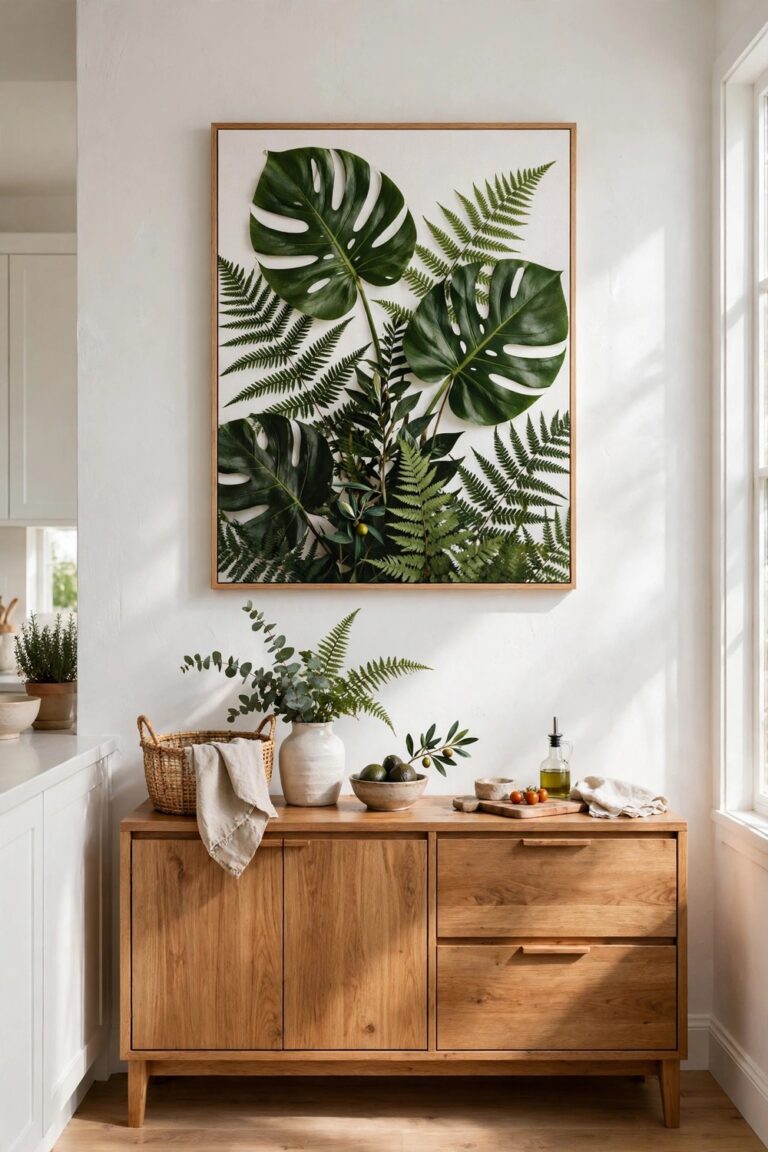
How to Choose Prints That Survive a Kitchen
Start with the wall, not the artwork. Steam, splashes, and cooking grease reach further than you expect.
Keep prints at least 12 inches from the hob and the sink unless they sit behind glass in a sealed frame.
Choose glass or acrylic glazing near water and heat, and save unglazed paper prints for dry walls.
Match the frame to the room. Thin black frames suit modern kitchens, while pale wood warms up white walls.
1. Bold Typography Posters
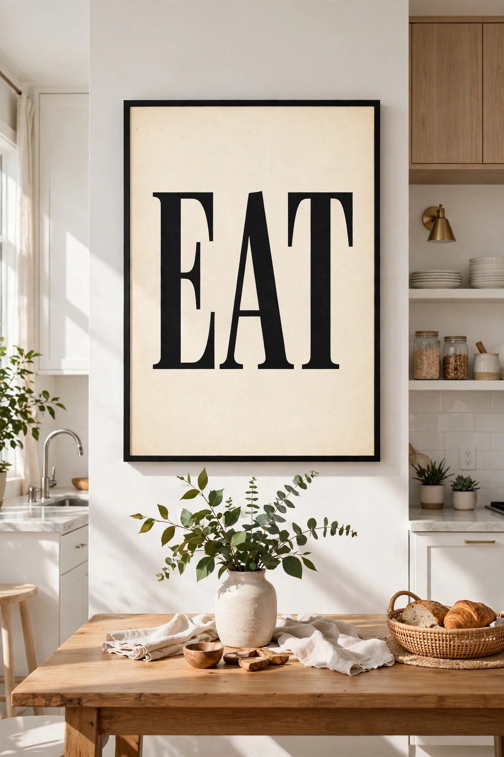
One giant word can carry a whole wall. Think EAT, SIMMER, or TASTE in chunky black type on warm cream paper.
Hang a single poster above the dining table, centred on the chairs below. The letters become the focal point, so keep the rest of the wall bare.
Or hang three narrow posters in a row, one word each. Keep the gaps even, about two inches, and align the tops.
Choose a font with real character, not a plain system font. A bold serif or a hand-drawn sans serif reads warm, not corporate.
2. Close-Up Food Photography Prints
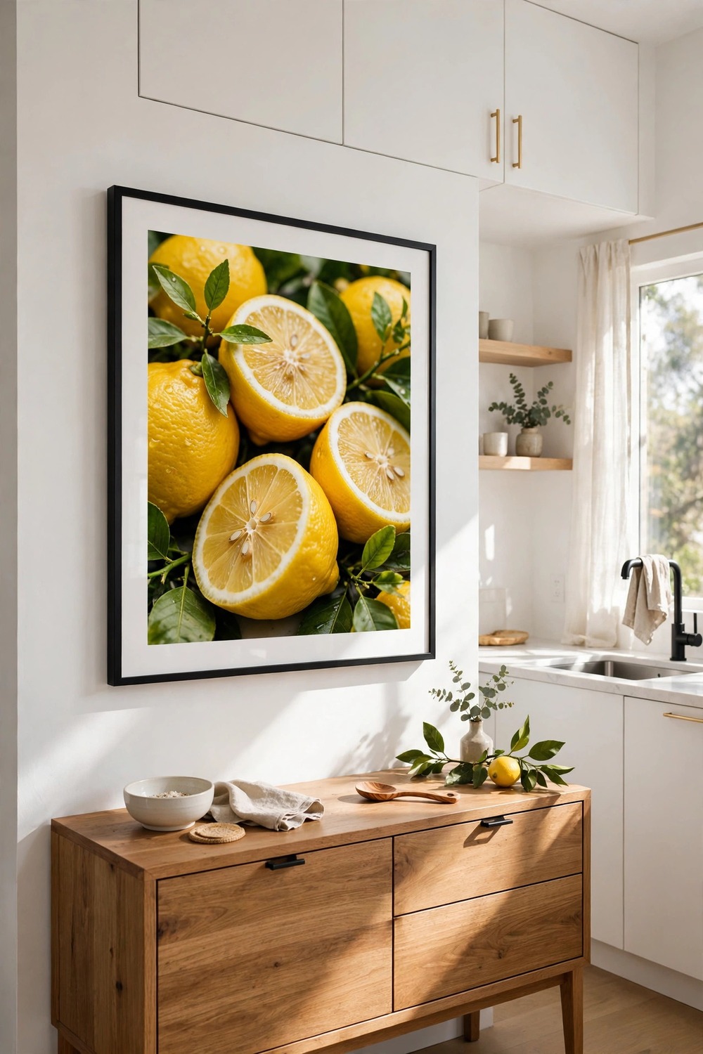
A close-up photo of split lemons or a crusty loaf turns ordinary food into art. The colour does the work, so the frame should stay quiet.
Pick one large print, at least 24 inches wide, and hang it above a sideboard or dresser. A single oversized photo beats three small ones here.
Use a thin black or white frame with a wide white mount. The mount gives the photo breathing room and keeps the colours from touching the frame.
Avoid glossy prints near a window, since glare hides the detail. Matte paper suits bright kitchens best.
3. Vintage French Market Posters
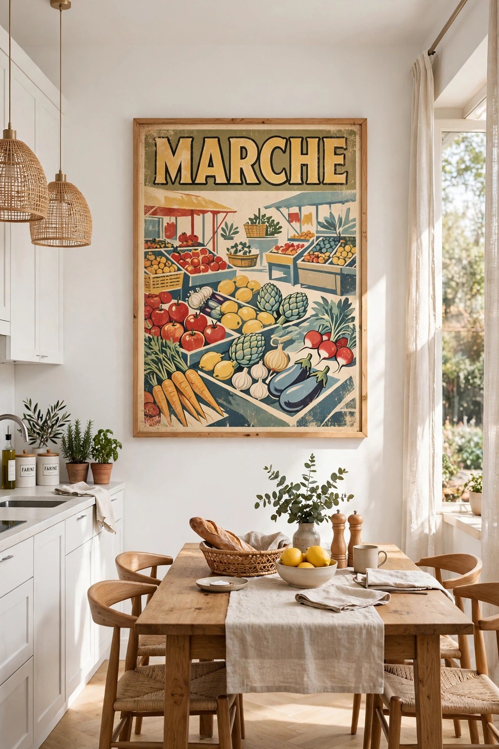
Old French market posters bring colour and a holiday feeling to a plain wall. Look for faded reds, mustard yellows, and soft blues with simple lettering.
Choose one large poster and let it own the wall above the table. A poster this busy needs space around it, so skip the neighbouring frames.
Check the spelling on the lettering before you buy. A misspelled French word stands out every single day.
Pair the poster with a simple wooden frame, no mount, so the artwork runs right to the edge.
4. Minimal Line Art Posters
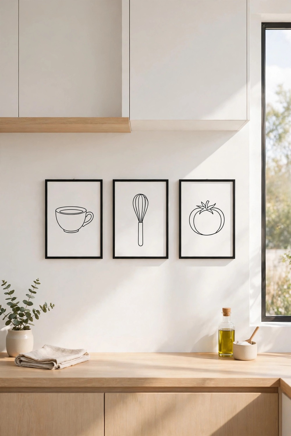
A single continuous line can draw a coffee cup, a whisk, or a tomato with surprising charm. These posters suit calm, uncluttered kitchens best.
Hang a row of three small prints in identical thin frames. Keep them level and evenly spaced, like a quiet sentence across the wall.
Black ink on white paper is the classic choice, but a deep green or terracotta line warms the look. Match the ink colour to one accent in the room.
Leave the wall around them empty. Line art loses its power when it competes with clutter.
5. Botanical Herb Identification Prints
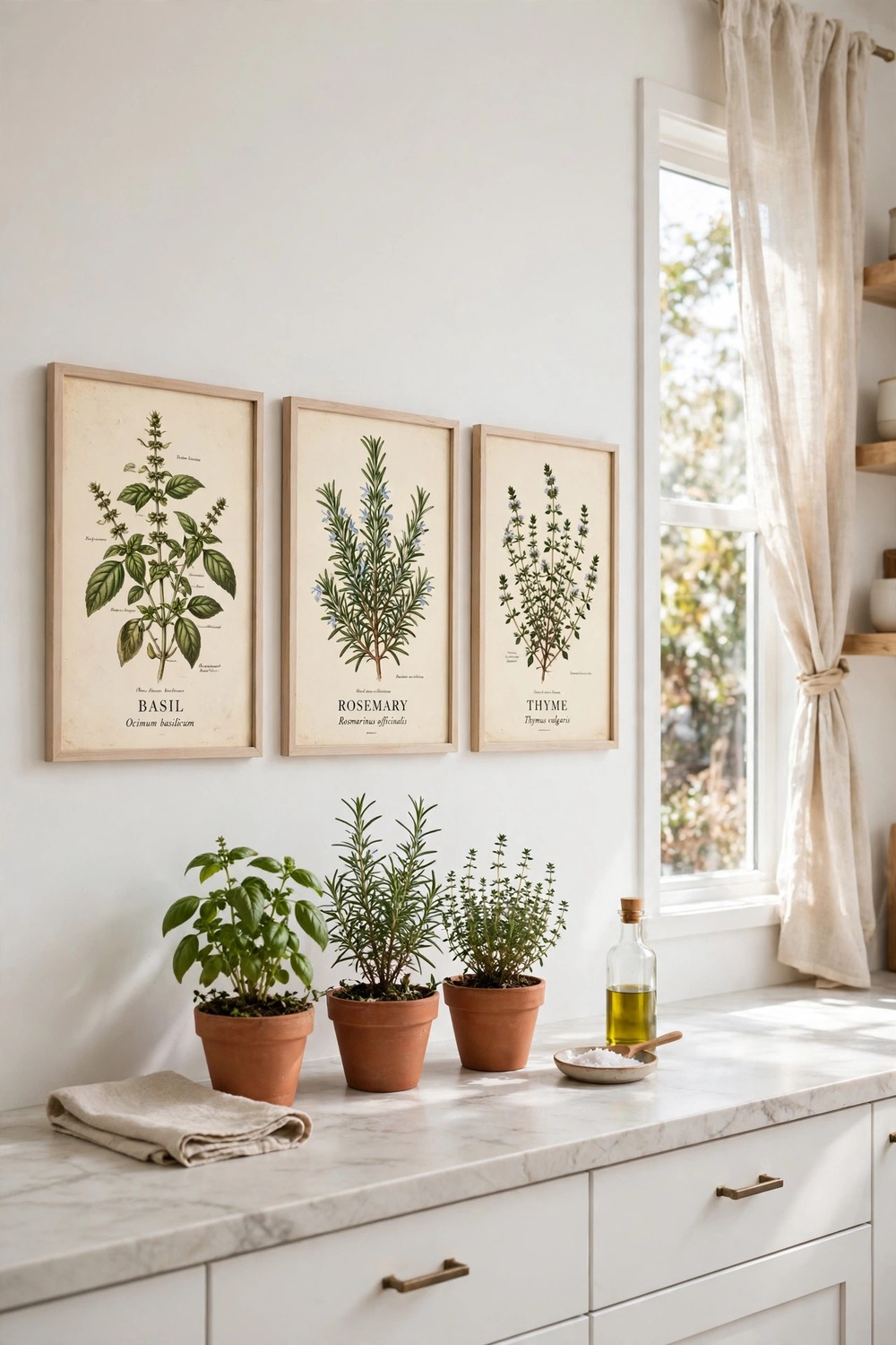
Vintage herb charts label each plant with its name and a careful drawing. Basil, rosemary, and thyme look beautiful and teach you something too.
Hang a set of three or four in matching frames near your herb pots or the prep counter. The prints and the real plants echo each other nicely.
Choose prints with cream backgrounds and fine green detail, not heavy dark borders. Pale paper keeps a small kitchen feeling light.
Frame them under glass if they hang near the sink, since steam can curl unprotected paper over time.
6. Hand-Lettered Quote Posters
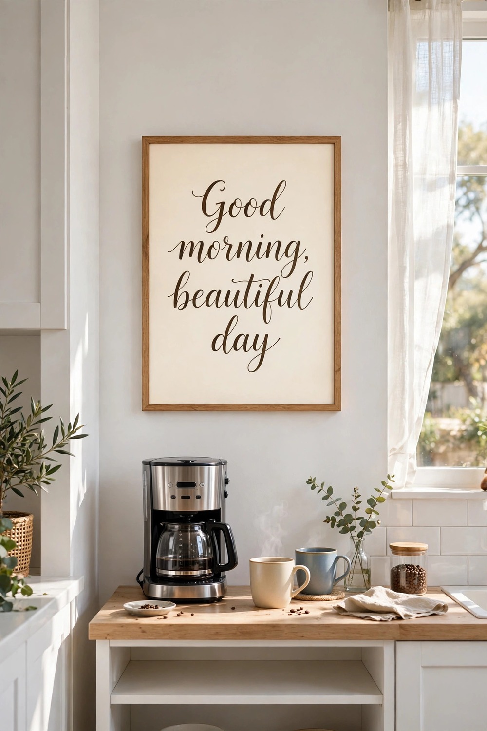
A short hand-lettered phrase on paper feels personal in a way a shop-bought sign never does. Pick words you actually say at home, not a slogan you would never use.
Frame one poster above the coffee station, where you will read it every morning. Large, clear lettering matters more than fancy flourishes.
Keep the background warm cream and the ink dark brown or black. High contrast keeps the words readable from across the room.
Skip long quotes here. Two short lines read instantly, while a paragraph turns into wallpaper.
7. Illustrated Vegetable Posters
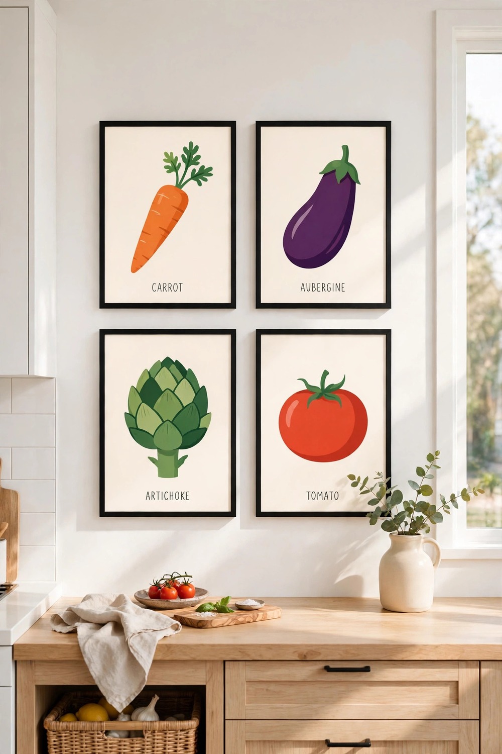
Flat, colourful illustrations of carrots, artichokes, and aubergines bring a playful energy to a white kitchen. The style is modern, but the subject is timeless.
Hang four prints in a neat two-by-two grid above a counter or a small table. Identical frames and even gaps keep the bright colours from feeling chaotic.
Pick prints that share one background colour, such as warm white or pale sage. A shared background ties the set together.
This idea suits family kitchens especially well, since children love spotting each vegetable.
8. Retro Diner Posters
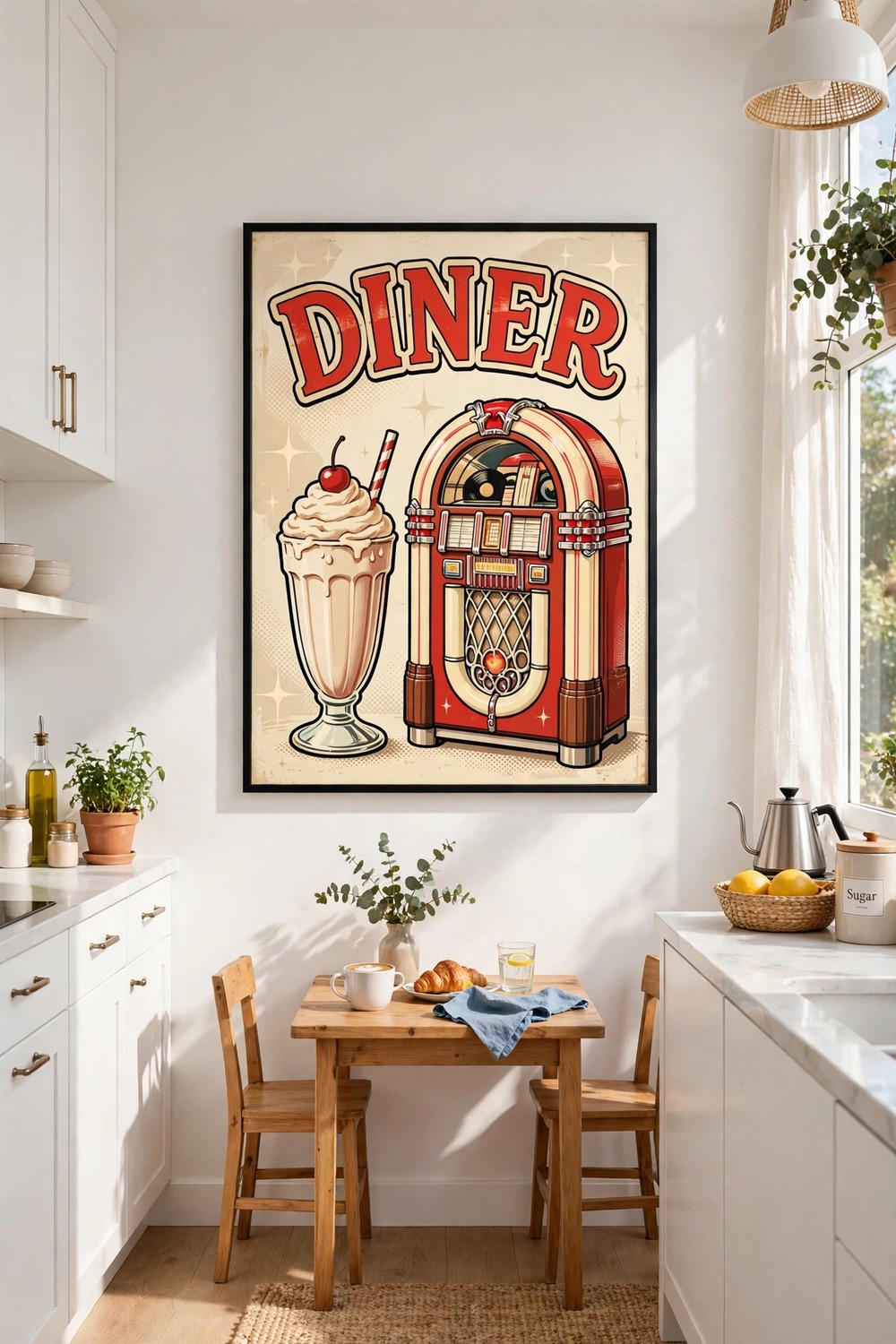
A retro-style diner poster, all cherry red and cream, adds instant fun to a plain wall. Look for bold lettering and simple images of milkshakes, burgers, or a jukebox.
Hang one large poster as a statement piece, ideally on the wall you see when you walk in. It sets the mood for the whole room.
Keep the frame simple and dark, so the bright poster colours stay the star. A thin black frame works well.
Use this style sparingly. One retro poster charms, while three can turn a kitchen into a theme park.
9. Printed Café Menu Posters
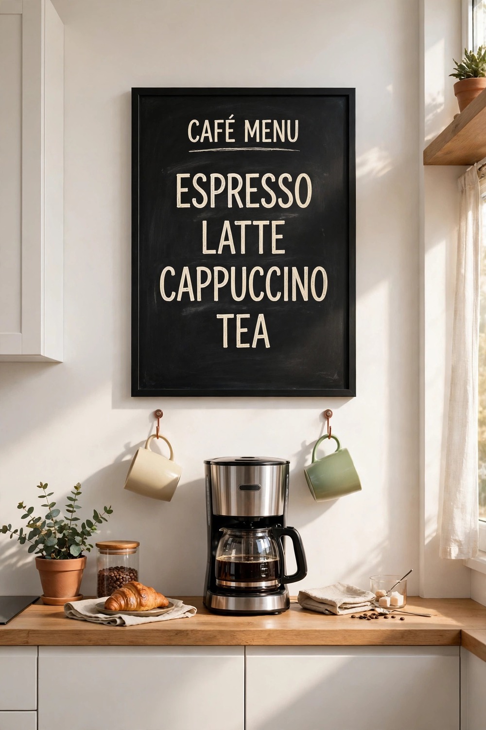
A printed menu poster lists coffees, teas, and breakfast dishes in neat chalkboard-style type. It turns the coffee corner into a tiny café.
Hang it directly above the coffee maker, centred on the machine below. The poster and the station should read as one unit.
Choose a poster with a dark background and cream lettering for a true café feel. A pale version suits brighter, modern kitchens better.
Leave a small shelf or hook beneath it for mugs, so the poster is part of a working corner, not just decoration.
10. Coffee Origin Map Prints
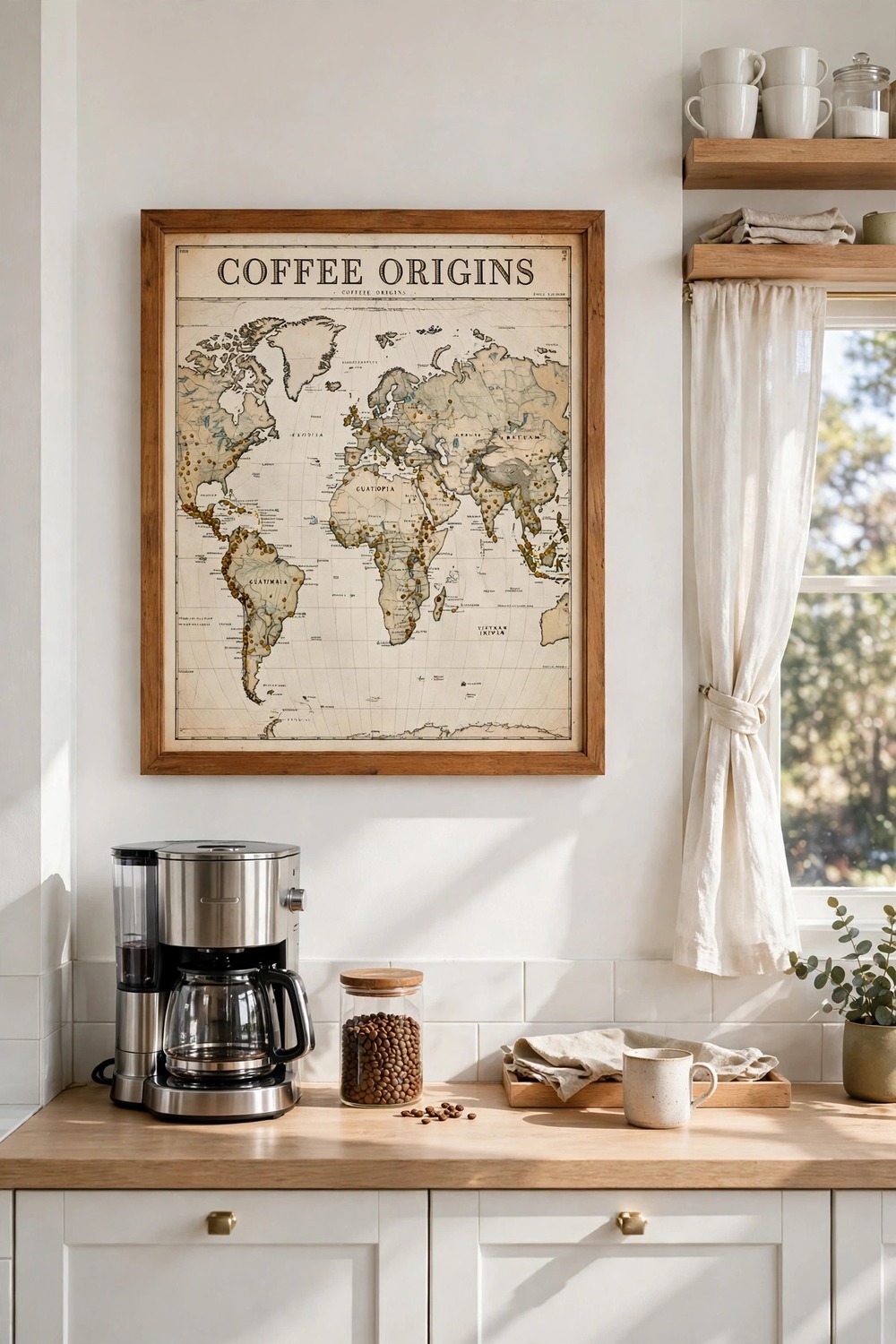
A map of coffee-growing regions turns a love of coffee into wall art. Small markers show where beans come from, from Ethiopia to Colombia.
Frame one map print above the coffee station or the dining table. A muted, vintage-style map suits most kitchens better than a bright modern one.
Choose a print with clear, readable place names, since the map invites a closer look. Tiny, blurry text frustrates everyone.
Pair it with a warm wood frame to echo the brown tones of coffee. Keep the wall around it clear so the map stays the focus.
11. Abstract Colour Block Posters
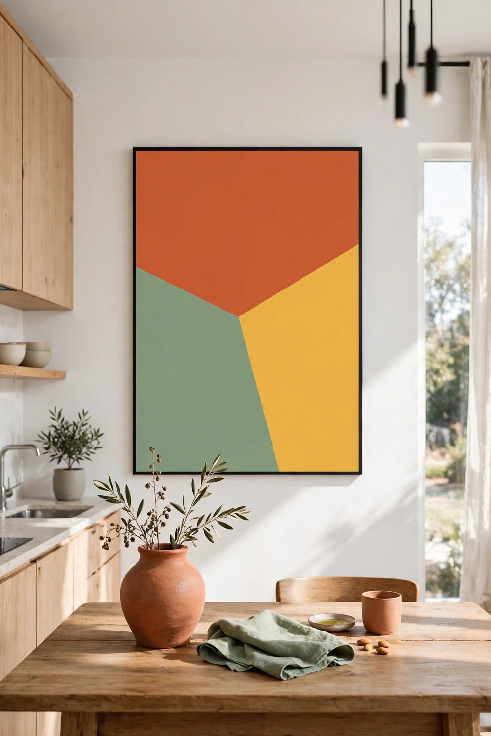
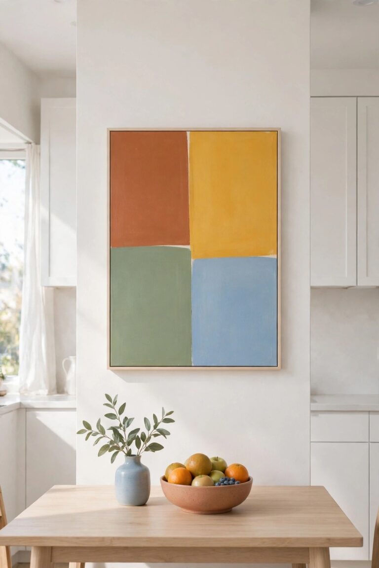
Bold blocks of terracotta, sage, and mustard can lift a white kitchen without any subject at all. The colour itself is the decoration.
Hang one large poster above the table and pick up its colours elsewhere, in a tea towel or a plant pot. The link makes the poster feel planned, not random.
Size the poster to cover about two-thirds of the wall width above the furniture below. Smaller looks lost, while wider overwhelms the table.
Choose matte paper and a slim frame. Glossy finishes fight with the flat blocks of colour.
A good poster does not just fill a wall — it gives the whole kitchen something to say.
12. Watercolour Food Illustration Posters
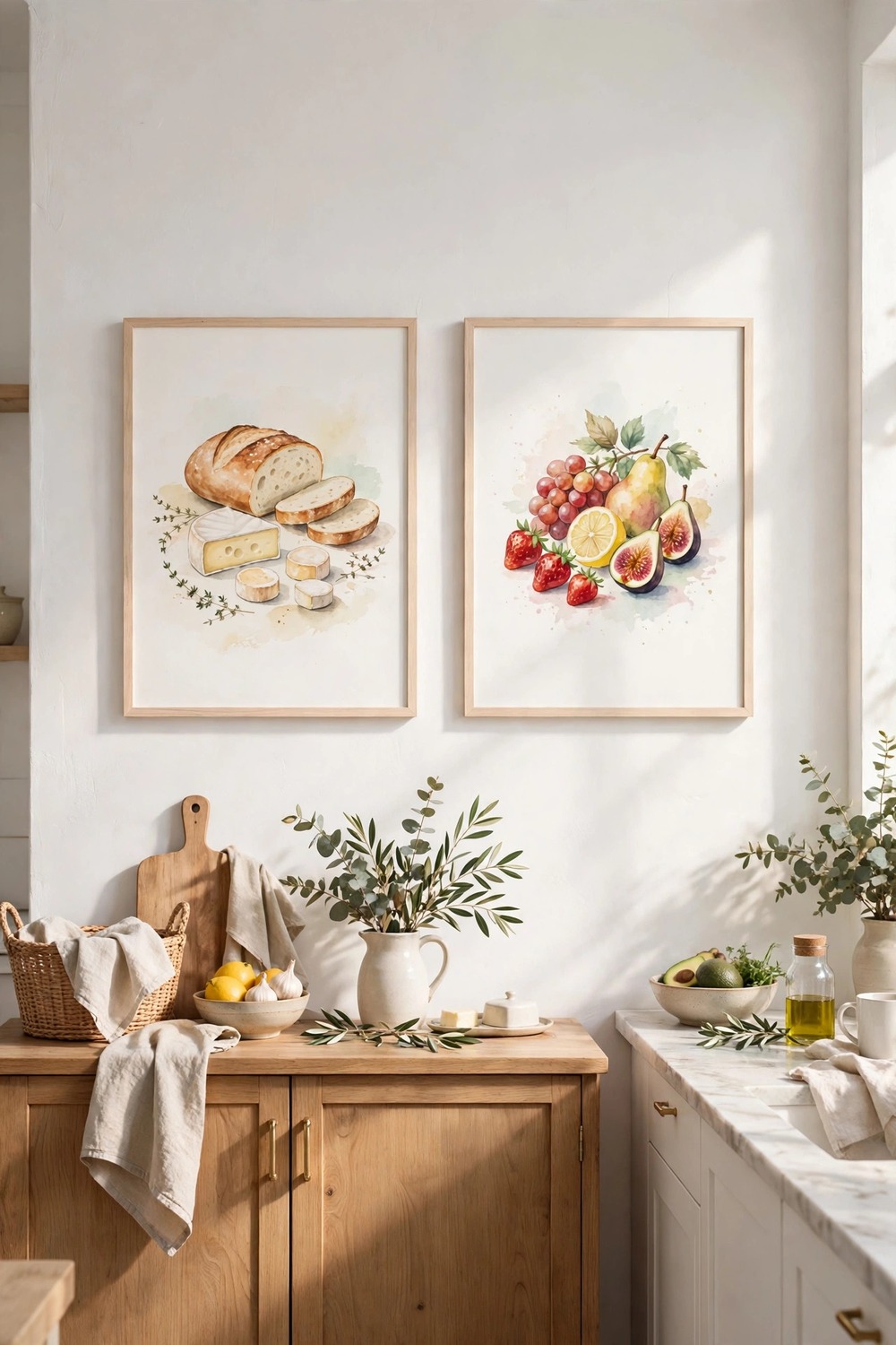
Soft watercolour paintings of bread, cheese, and fruit feel gentle and handmade. Loose brushwork and pale washes suit country and cottage kitchens beautifully.
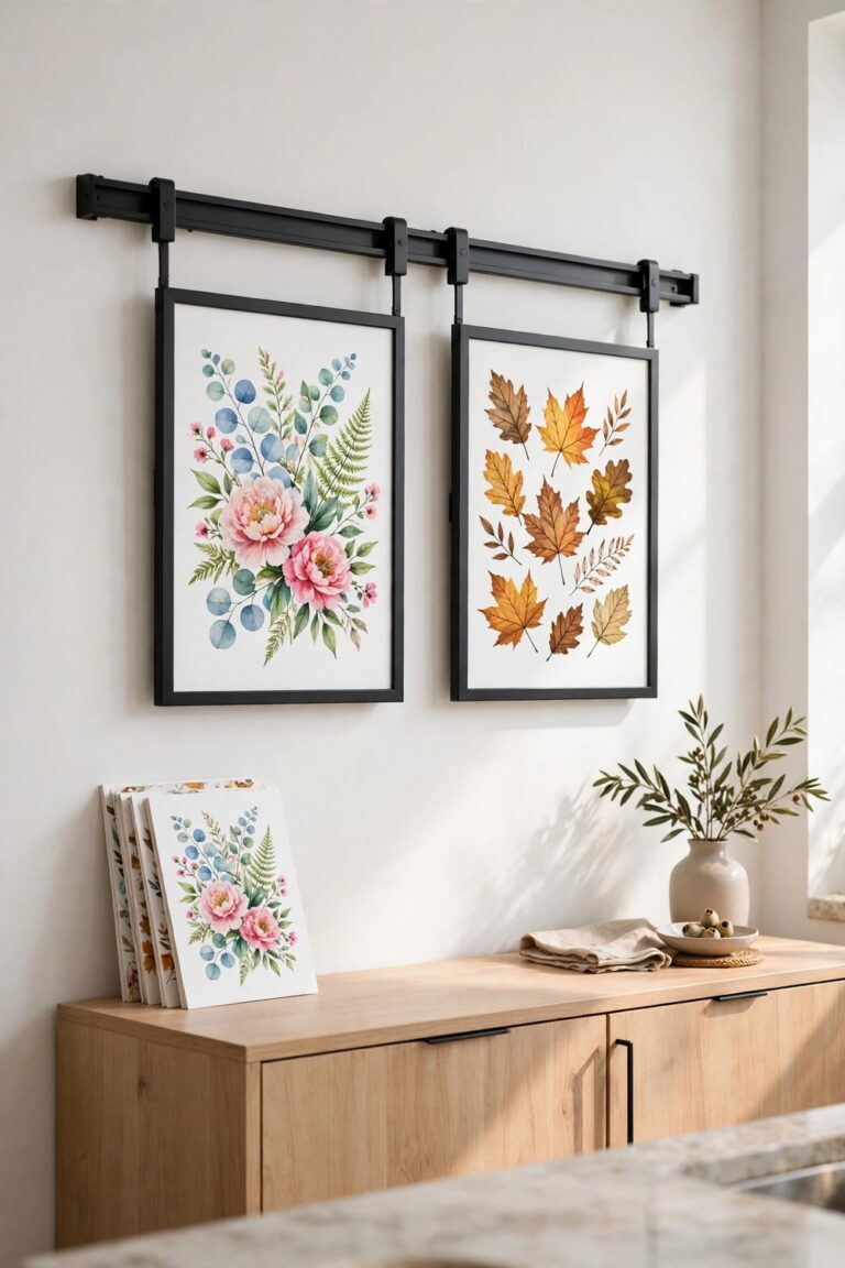
Hang a pair of matching prints side by side above a sideboard or dresser. Keep the frames identical and the gap between them narrow, about two inches.
Choose prints with plenty of pale background, so they lift a dark corner instead of weighing it down. Heavy, dark watercolours can feel gloomy in a small kitchen.
Frame them under glass away from the hob, since watercolour paper and steam are a bad mix.
13. Vintage Seed Packet Prints
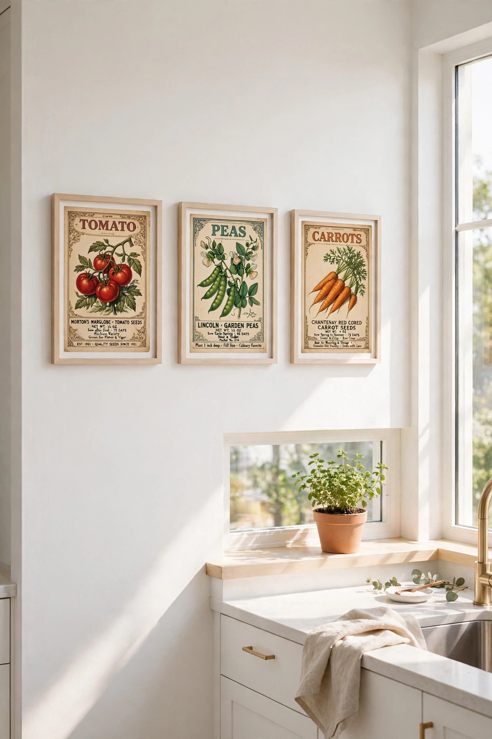
Enlarged prints of old seed packets carry charming illustrations and beautiful old typography. Tomatoes, peas, and carrots each get their own little artwork.
Hang a row of three small prints in matching frames near a window or above a potting shelf. The garden theme feels natural beside real plants.
Look for prints with clear, correctly spelled packet names and bright, unfaded colours. A washed-out reprint loses the charm.
Keep the frames thin and pale, so the colourful packets stand out. A dark heavy frame would swallow these small prints.
14. Kitchen Conversion Chart Posters
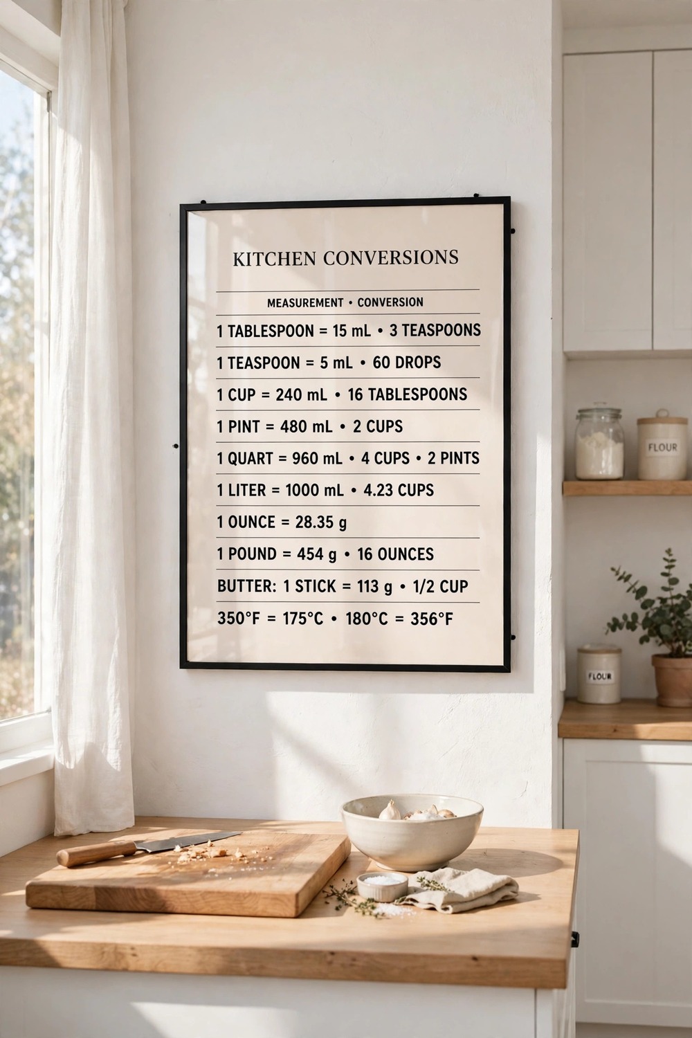
A conversion chart poster lists cups to grams, oven temperatures, and spoon measures in one clear grid. It decorates the wall and saves you reaching for your phone mid-recipe.
Hang it near the prep counter, at eye level, where you can read it while cooking. A chart you cannot read is just decoration.
Choose a large, clear typeface with strong contrast, and frame it under glass. Grease and flour dust wipe off glass, but they stain bare paper.
Pick a design that matches your kitchen colours, so a practical poster still looks like it belongs.
15. Mixed-Size Poster Gallery Wall
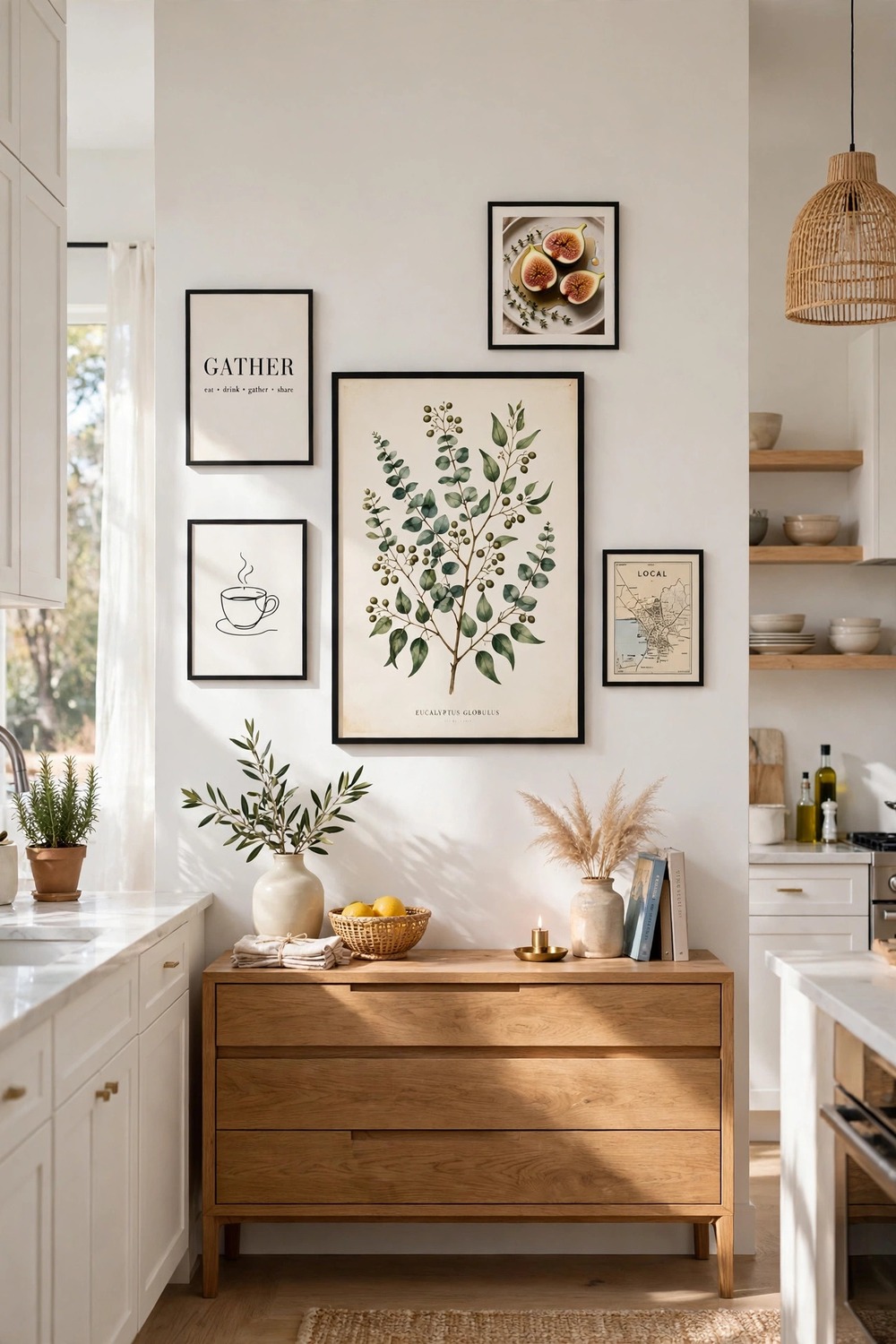
A gallery wall of mixed poster sizes lets you combine several favourites on one wall. One large anchor poster sets the tone, and smaller prints fill in around it.
Lay every frame on the floor first and shuffle them until the arrangement feels balanced. Start with the largest poster slightly off-centre, then build outward.
Hang the centre of the whole arrangement at eye level, about 57 inches from the floor, so the wall feels natural to look at.
Keep two inches between frames and one shared frame colour throughout. Mixed sizes already add variety, so matching frames keep the wall calm.